Luma Skin
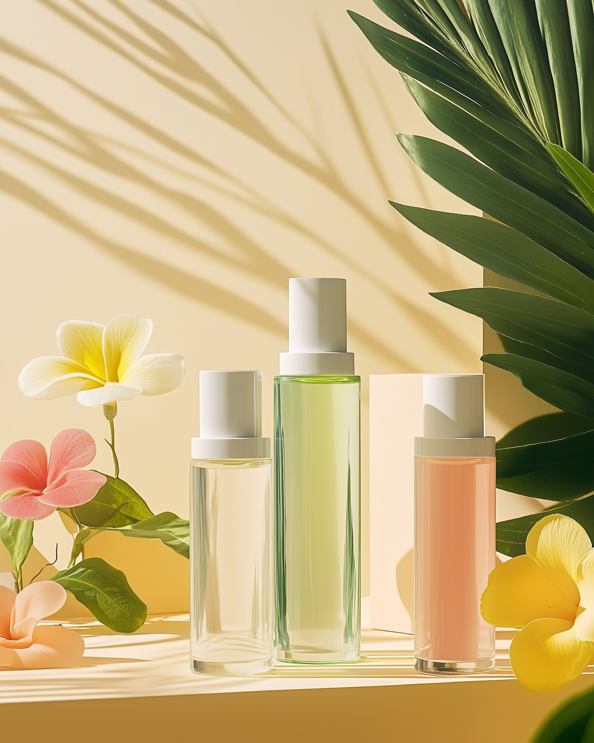
A pastel-bright identity and modular packaging system for a clinical skincare label that wanted to feel joyful, not medical.
Client
Luma Skin Co.
Discipline
Brand identity & packaging
Year
2026
Timeline
4 months

01
The story
Brief · Approach · Outcome
Headline result
+182% online conversions
Strategy · Identity · Packaging · Shopify
The brief
They came to us with a strong product and a brand that no longer said what they meant. The brief fitted on one page: make something honest enough to last a decade and bright enough to be noticed on day one.
The approach
We started with a week of listening — founders, customers, the people who make the product. Every decision after that was an edit rather than an addition: one typeface, a tight palette and a tone of voice the team now writes in without us.
The outcome
A system that bends without breaking, launched across packaging, retail and digital in a single season. The numbers moved quickly; the compliment we value most is that people assume it has always looked this way.


They gave our science a personality — customers now photograph the boxes before they open them.
Maya Holt, Founder
Next project
Arcadia Residences
